From Blog-post to Website in 2 weeks
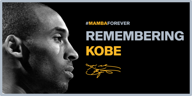
August 24th (24/8) is named “Kobe Day” to honor him (his jersey numbers were 8 & 24). As fans, we had curated amazing stories about Kobe Bryant. What started as a blog post with curated stories from different sources is now turned into a website.

We successfully designed, developed, and also announced it on various social media platforms on Kobe Day (Aug 24th) and paid tribute to the legend in a small way.
The Style Guide & the Logo
Since Kobe played for the Lakers & this website is a tribute to him, we chose the official Los Angles Lakers colors - famous Yellow & Purple, along with shades of black & white. Decided to use dark theme in order to honour the memorial and rememberance of Kobe.

Theme used was bold & mdern. Fonts used to match that theme were Shapiro for bold headings & Ubuntu for body text which gives modern look & feel.
Regarding logo, first used type based logo, but later changed to Kobe Bryant’s signature to match the theme of the website.

Content Flow
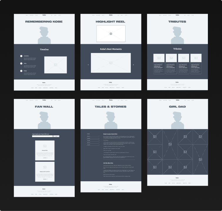
A static site with a simple content leading to IA, which then went on to map on 6 different pages in the website.
Content Format -> Turned to Website Pages
• His Legacy of facts -> Timeline Page
• Stories from other players -> Tales Page
• His relationship with his daughters -> Girl Dad Page
• Tributes from fans around the world -> Tributes Page
• Best videos from his NBA Career -> Highlight Reel Page
• Tributes on the webiste through Tweets -> Fan Wall Page
Wireframes
Based on content flow, brainstormed the how content should be displayed on the website using pen and paper (low-fidelity wireframes). Then converted them to high-fidelity wireframes in Figma with the help of Invision Form UI kit.

Converting Wireframes to Final Designs
Since wireframes itself was high-fidelity, adding original content to see how the final website would look was easier. Tweaked the wireframes by changing fonts and colors according to style-guide and created the final designs. Also, made the design responsive for mobile usage puposes as well. Most of the content was written by the team.

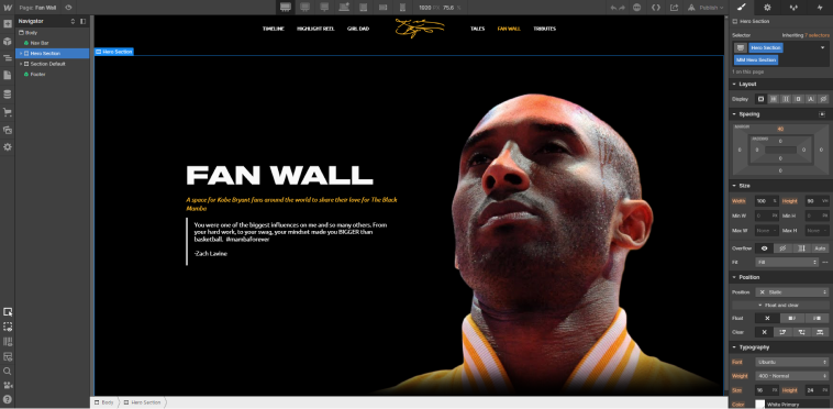
Website Development using Webflow
Recreated the style-guide on Webflow on a separate page for faster website development and converted all the requirements from design to development. Worked also on responsiveness to make sure it’s properly accesible in all screen sizes.
Added various transitions and animations in webflow to make the experience better.

Another thing! Also took help form a friend @VivekChandraBS to use Twitter API to automatically fetch the tweet embed code from the submitted tweet link.
Link to Website


